Unlock the secrets to creating a vibrant and inviting home interior with the perfect color scheme for every room.
Choosing the perfect color scheme for your home interior is a transformative process that shapes the aesthetic appeal and overall ambience of your living space. Carefully selecting colors can significantly impact mood, perception of space, and even energy flow within your home. This comprehensive guide will explore the art of choosing the ideal shades to create a harmonious, inviting atmosphere that reflects your style and preferences.
Your choice of color combination for home interior painting sets the tone for the entire space, influencing everything from the mood to the perceived size of the rooms. By opting for the best color choices, you can create a visually appealing environment that reflects your personality and style.
Homeowners often underestimate the impact of home interior color combinations on their daily lives. The hues you surround yourself with can profoundly affect your mood and well-being. For instance, warm shades like reds and oranges can evoke feelings of cosiness and intimacy, while cool tones like blues and greens promote a sense of calm and relaxation.
Moreover, the choice of paint colours for home interior can also affect how spacious a room appears. Lighter shades tend to make rooms feel larger and more airy, while darker tints can create a sense of intimacy and cosiness. By strategically incorporating different hues into your color palettes for home interiors, you can manipulate the perception of space to suit your needs.
Finding the best color combinations for your home interior involves a balance of personal preference, practicality, and aesthetic appeal. Here are some tried-and-tested combinations that can elevate the look and feel of any living space:
Navy blue adds depth and sophistication, while gold accents bring warmth and luxury to the space.
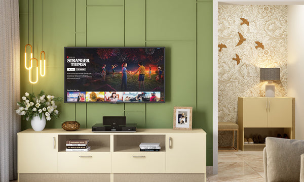
Sage green evokes a sense of tranquillity and freshness, complemented by soft neutrals like beige and cream for a serene and inviting atmosphere.
This elegant combination juxtaposes the softness of blush pink with the richness of charcoal grey, creating a chic and modern look with a hint of romance.
Terracotta tones bring warmth and earthiness to the space, especially when paired with warm earth tones like ochre, burnt sienna, and olive green for a cosy and inviting feel.
A timeless classic, the monochrome black and white color scheme adds sophistication and contrast to any interior, creating a bold and dramatic statement.
Soft pastel shades like pale pink, baby blue, and mint green paired with muted blues create a calming and soothing atmosphere, perfect for creating a sense of serenity in any room.
Earthy brown tones combined with deep teal create a rich and luxurious color palette that is both elegant and inviting, adding depth and character to your home interior.
Achieving harmony and balance in your home's interior color scheme is essential for creating a welcoming environment. Understanding the principles of aesthetical harmony allows you to create a cohesive and balanced look throughout your home. Here are some tips for achieving that:
Start With a Base Colour: Begin by selecting a base shade that will serve as the foundation for your color scheme. This could be a neutral shade like beige, grey, or white, providing a backdrop for other hues to build upon.
Use the 60-30-10 Rule: Follow the 60-30-10 rule when choosing colors for your interior. Allocate 60% of the room to a dominant shade, 30% to a secondary tint, and 10% to an accent color. This helps maintain a balanced and cohesive look throughout the space.
Consider the Mood: Consider the mood you want to create in each room and choose colors accordingly. Warm shades like reds, oranges, and yellows can evoke energy and excitement, while cool blues and greens promote relaxation and tranquillity.
Stick to a Color Palette: Limit the number of colors you use in each room to avoid overwhelming the space. Stick to a cohesive color palette of 3-5 shades that work well together and complement each other.
Balance Warm and Cool Tones: Strike a balance between warm and cool tones to create visual interest and depth. Pair warm tints with cool neutrals or vice versa to prevent the room from feeling too one-dimensional.
Use Color Psychology: Take advantage of color psychology to evoke specific emotions and feelings within your home. For example, blue is calming and promotes concentration, while yellow is energising and uplifting.
Paint colors have the power to transform any space, making it essential to choose wisely. Whether you prefer bold, vibrant hues or subtle, calming tones, paint shades can breathe life into your interiors. Here are some tips for selecting paint colors that complement your style and preferences:
In Vastu Shastra, colors play a crucial role in balancing the energy flow within different areas of the home. Here are some recommended Vastu colors for various rooms and spaces:
Ideal colors for the living room include warm and inviting shades such as cream, beige, light yellow, soft green, and light blue. Avoid using dark or bold colors, as they can create a sense of heaviness in the room.
Bedrooms should have calming and soothing colors that promote relaxation and restful sleep. Recommended shades include soft pastels (light pink, peach or lavender), light blue, soft green, and beige. Avoid using bright or stimulating colors in the bedroom.
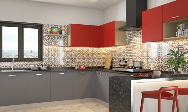
The kitchen represents nourishment and prosperity in Vastu. Opt for vibrant and energetic tints that stimulate the appetite and promote positivity, such as yellow, orange, red, and light green. These colors can enhance the kitchen's energy and promote harmony among family members.
For spaces dedicated to concentration, focus, and productivity, choose colors that stimulate mental clarity and creativity, such as light yellow, light green, light blue, and white. These hues create a conducive environment for studying, working, and problem-solving.
Choosing the perfect colour scheme for your home interior is a decision that should be approached with careful consideration. By following these tips and exploring different color combinations, you can create a living space that reflects your personality, enhances your mood, and proves to be a welcoming retreat for you and your loved ones. Remember, the key is to have fun and trust your instincts as you transform your home with the perfect colour scheme.
Also, check out
1. Why is choosing the right color scheme important for home interiors?
Choosing the right color scheme is crucial for home interiors as it sets the mood, enhances space perception, and reflects personal style.
2. What are some popular color schemes for home interiors?
Popular color schemes for home interiors include monochromatic, analogous, complementary, and triadic schemes.
3. What are the basic colour schemes, and how do they impact a room?
Basic color schemes like monochromatic create a cohesive look, analogous schemes offer harmony, complementary schemes provide contrast, and triadic schemes bring vibrancy to a room.
4. What are the current popular trends in home interior color schemes?
Current trends include earthy tones like terracotta and olive green, muted pastels for a calming effect, and bold jewel tones for accents. Warm neutrals like beige and taupe are also popular.
3rd Floor, Ascendas Park Square Mall, ITPL Main Rd Bengaluru, Karnataka, India
Phone No. 080-68065060
Show in MapEDIFICE, Plot No.154, III & IV OMR), Okkiam Thoraipakkam, Tamil Nadu, India
Phone No.
Show in Map50/1 Platina, Miyapura Road Hyderabad, Telangana, India
Phone No. 080-68065060
Show in Map3rd Floor, Raichandani Construction Building Hyderabad, Telangana, India
Phone No. 080-68065060
Show in MapBhagwati Greens, Plot No. 6, Shop No 3&4 Navi Mumbai, Maharashtra, India
Phone No. 080-68065060
Show in MapShop No-11, Dosti Imperia, Ghodbunder Road Thane, Maharashtra, India
Phone No. 080-68065060
Show in MapShop No. 24,25 & 26, Amar Tech Park, Near MIS International School Pune, Maharashtra, India
Phone No. 080-68065060
Show in Map6th Floor, Primarc Square, Block LA 1, Sector 3, Bidhannagar, Salt Lake Kolkata, West Bengal, India
Phone No. 080-68065060
Show in MapSF - 9, Times Square -2, Near Avalon Hotel, Sindhu Bhavan Marg, Thaltej Ahmedabad, Gujarat, India
Phone No. 080-68065060
Show in Map2nd Floor, Opp. to Hotel Quality Inn Bez Krishna, Above BOB Asilmetta Branch Visakhapatnam, Andhra Pradesh, India
Phone No. 080-68065060
Show in Map3132 & 3132/A, 1st Floor 'KB' Arcade Kalidasa Road, Jayalakshmi Puram Mysuru, Karnataka, India
Phone No. 080-68065060
Show in Map110-113, 1st Floor Meena HighRise, Thiru Venkataswamy Rd(west),R. S Puram Coimbatore, Tamil Nadu, India
Phone No. 080-68065060
Show in Map


